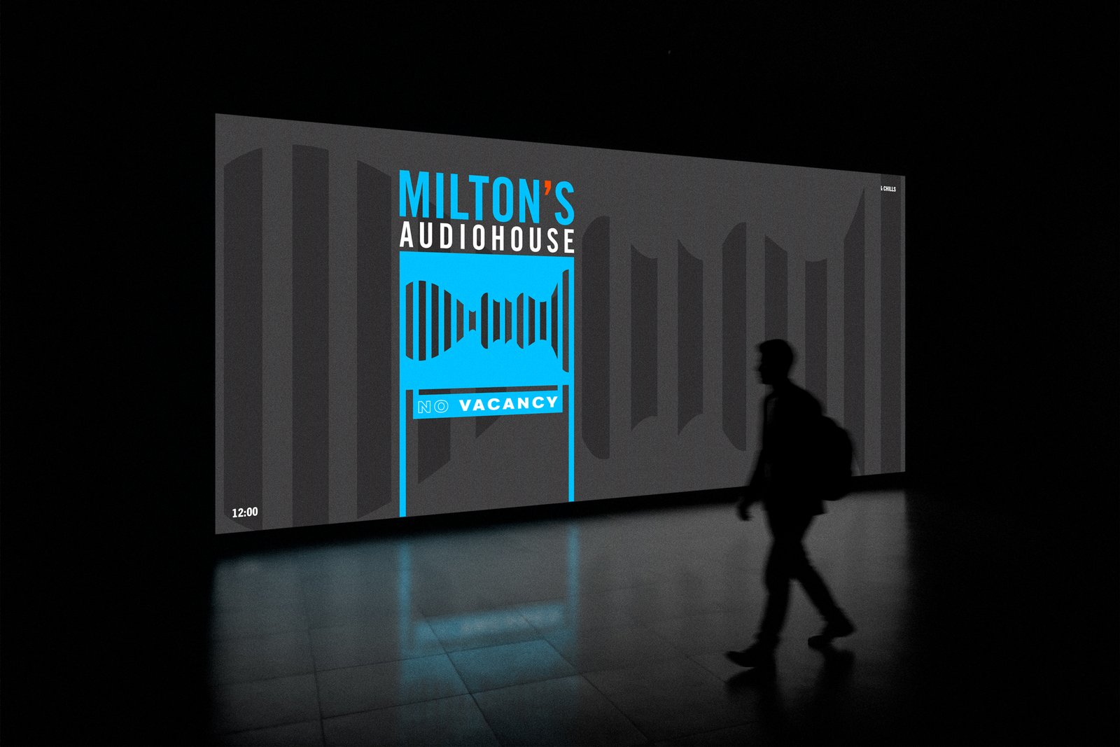
The logomark is flexible and responsive, and can work independently without the name maintaining instant brand recognition and memorability.
The typography is set in a strong traditional lighted motel sign stye.
Blue has been used as the main brand color combined with an orange linked to the parent company strategically added to the inverted comma to connect with the original essence of writing.